
Graphics
An important aspect of communication is imagery. Both technical writers and workplace communicators use graphs, diagrams, images, drawings, charts, and other visual elements to inform and engage their readers. During this chapter, you will learn how to integrate visual design elements in many different documents. There is an old saying that a picture is worth a thousand words. Sometimes, despite writing clearly and concisely, your audience will appreciate the presence of supporting graphics–whether that be tables, illustrations, maps, photos, charts, or some other type of other visual aid.
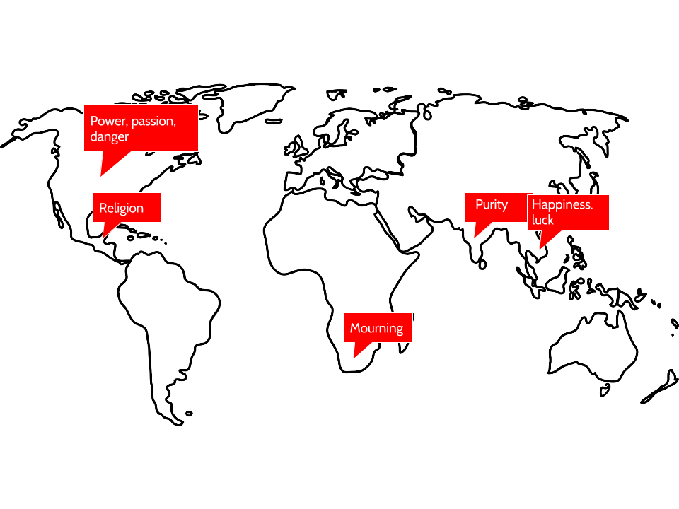
When creating graphics, it is important to keep your audience in mind. This relates not just to the content you share but also how that content appears on the page. Are you aware, for instance, that the same color has different meanings across various cultures? Take a look at the graphic below and notice how the color red means something extremely different across cultures. Similar differences exist across cultures with other colors, as well, so be aware that the choices you make in colors for your graphics may communicate ideas you do not actually intend.
Before creating, formatting, and incorporating graphics, consider the types of imagery that might be most beneficial and their functions. You can use graphics to represent the following elements in your writing:
- Objects — If you’re describing a fuel-injection system, you’ll probably need a drawing or diagram of the system. If you are explaining how to graft a fruit tree, you’ll need some illustrations of how that task is done. Photographs, drawings, diagrams, and schematics are the types of graphics that show objects.
- Numbers — If you’re discussing the rising cost of housing in Vancouver, you could use a table with the columns being for five-year periods since 1970; the rows could be for different types of housing. You could show the same data in the form of bar charts, pie charts, or line graphs. Tables, bar charts, pie charts, and line graphs are some of the principal ways to show numerical data.
- Concepts — If you want to show how your company is organized, such as the relationships of the different departments and officials, you could set up an organization chart, which is boxes and circles connected with lines showing how everything is hierarchically arranged and related. This would be an example of a graphic for a concept; this type depicts non-physical, conceptual ideas and their relationships.
- Words — Graphics can be used to depict words. You’ve probably noticed how some textbooks may put key definitions in a box, maybe with different color in the background. The same can be done with key points or extended examples.
Documenting Graphics
Just as you would cite and reference a paraphrase or a direct quote, you must also cite and reference any graphics that you use that were created by someone else or that were based on someone else’s data. Indicate the source of any graphic or data you have borrowed. Whenever you borrow a graphic or data from some other source, document that fact in the figure title using an in-text citation. You should also include the reference information in the reference list.
Guidelines for Using Graphics
Use graphics whenever they would normally be necessary—don’t be scared because it seems like they are too much trouble! Graphics can help keep your reader engaged and provide information in a new way that is easier to understand. Here are a few tips to keep in mind when adding graphics to a document:
- Like all writing and design choices, you’ll want to make sure your graphics are appropriate to your audience, subject matter, and purpose — don’t zap beginners with advanced, highly technical graphics they can’t understand.
- Use both graphics and text on the same page. Place graphics as near to the point in the text where they are relevant as possible, and don’t put them on pages by themselves or attach them to the end of documents. However, if a graphic does not fit properly on one page, put it at the top of the next, and continue with regular text on the preceding page. Don’t leave half a page blank just to keep a graphic near the text with which it is associated.
- Always introduce graphics in nearby text preceding the graphic. Don’t just throw a graphic out there unexplained. Orient readers to the graphic and explain its basic meaning. Graphics are not there for decoration. They need to have a purpose and be introduced before the reader encounters them on the page. The first mention of a graphic is called a lead-in statement, and your graphics must always be introduced by a lead-in. Similarly, it is typically recommended to also use a lead-out statement after the graphic. This is a statement that connects the figure to the material that follows. Use titles and labels for graphics and include identifying detail such as illustration labels, axis labels, keys, and so on. Finally, make sure graphics fit within normal margins—if they don’t, enlarge or reduce the copies. Leave at least two blank lines above and below graphics.
Adapted from two chapters:
- “Graphics” from the Online Technical Writing Textbook by D. McMurray and is used under a CC-BY 4.0 International license and
- “8.2 Other Considerations: Audience” by Allison Gross, Annemarie Hamlim, Billy Merck, Chris Rubio, Jodi Naas, Megan Savage, and Michele DeSilva is licensed under a CC-BY 4.0 International license, except where otherwise noted.
Drawings, Diagrams, and Photos
To depict objects, places, people, and relationships between these items, you can use photos, drawings, diagrams, and schematics.
Illustrations and photographs run from minimum to maximum detail. A line illustration of how to graft a fruit tree reduces the detail to simple lines representing the hands, the tools, the graft stock, and graft. Diagrams are a more abstract, schematic view of objects or ideas, such as a wiring diagram of a clock radio (which hardly resembles the actual physical item at all). And of course photographs provide the most detail of all. These graphics, supplying gradations of detail as they do, have their varying uses.
Formatting and Citing Requirements
When you use an illustration in a report, there are several requirements to keep in mind.
Just about any illustration should contain labels words and phrases with pointers to the parts of the items or ideas being depicted.
If the illustration has certain shadings, colors, line styles, or other such details that have a special meaning in the illustration, these should be indicated in a key or legend in an unused corner of the illustration.
Ideally, you want illustrations, diagrams, and photos to be between one-half to one-quarter of the vertical size of the page. You should fit them on the page with other text. What you do not want is to append the graphic to the back of the report!
Make sure that your illustrations, diagrams, and photos fit neatly and comfortably within standard margins. You don’t want them spilling over into the right or left margins. You want to allow the equivalent of at least two blank lines above and below the graphic.
Illustrations, diagrams, and photos should have titles, and these titles should be numbered (Figure 1, Figure 2, and so on). The titles and figure labels should be placed below the graphic.
Illustrations, diagrams, and photos should be referred to from the relevant point in the discussion, and you should do more than just tossing in a “See Figure 2.” Discuss the illustration to focus the reader’s attention on the key details of the graphic.
Just as you would cite and reference a paraphrase or a direct quote, so too must you cite and reference any illustrations, diagrams, and photos that you use that were created by someone else or that were based on someone else’s data. Indicate the source of any graphic or data you have borrowed. Whenever you borrow a graphic or data from some other source, document that fact in the figure title using an in-text citation. You should also include the reference information in the reference list.
Photos and Illustrations
Photos are used in professional documents as tools for communicating a message that a writer feels can be strengthened through the use of proper imagery. Photographs can greatly enhance a message, some examples are discussed in the following checklists:
Illustration Checklist
Planning
- What kinds of illustrations are your audience familiar with?
- Do you have information that could be more easily or quickly communicated to your audience visually or in a combination of words and graphics?
- Do you have definitions that could be displayed visually in whole or in part?
- Do you have any processes or procedures that could be depicted in a flowchart?
- Do you have information on trends or relationships that could be displayed in tables and graphics?
- Do you have masses of statistics that could be summarized in tables?
- Do you need to depict objects? If so, what do you need to display about the objects? Do you need to focus attention on specific aspects of the objects? Do you require the realism of photographs?
- What are the design conventions of your illustrations?
- Are there suitable illustrations you could borrow or adapt? Or will you need to create them yourself?
Revising
- Are your illustrations suited to your purpose and audience?
- Do your illustrations communicate information ethically?
- Are your illustrations effectively located and easy to find?
- Are your illustrations numbered and labeled?
- Do your verbal and visual elements reinforce each other?
- Are your illustrations genuinely informative instead of simply decorative?
- When necessary, have you helped your readers to interpret your illustrations with commentary or annotations?
- Have you acknowledged the sources for borrowed or adapted tables and figures?
How To Use Pictures to Enhance Text
Pictures are an effective tool for giving visual representation of how to complete a task. They can stand alone or work in conjunction with the given text, and they can enhance a message if used properly.
If you are using pictures in conjunction with text: As in a set of instructions, the imagery increases the readers understanding of the task, in addition to decreasing confusion that may arise from text that stands alone. When using a picture to help portray how to perform a task, it is your responsibility to make sure the picture matches up with the text. You must explain the picture using text, and vice versa, explain the text using a picture. Also, the viewer will accomplish the task more often when the picture looks how it would if they were watching the task, not necessarily if they were experiencing it, an example is located in Figure 2, which depicts a hot air balloon being inflated.

Another example on using pictures to instruct: if your task was doing a cartwheel, you wouldn’t want the pictures at an angle where the person is looking through the eyes of the one doing the cartwheel. You would want the pictures to be from someone watching the event, so that the viewer isn’t confused by what they can’t see (such as where their feet are when they’re looking at their hands). It’s the simple choices that make or break a document when using pictures. Think and re-think the pictures you are using and how someone seeing them for the first time will react to them.

How a Finished Product Should Look
When textual information does not capture the essence of what you are trying to describe, try putting an actual photo of what you are trying to describe in the document. This type of picture enables you to more closely depict reality. Make sure your pictures are color and high quality. Black and white photos tend to blur easily on paper and lack the detail needed to fully understand a photo. Images help you cut down on excessive use of describing words. “A picture is worth a thousand words” relates to this situation.
Be sure to use the text wrap abilities of most word processors. A well-placed picture with clean text wrapping can make an otherwise overwhelming block of text seem reasonably approachable. Looking at twenty-five pages of block, justified alignment, plain black text is one of the most boring ways to see a report. A picture can liven up a report, make it more memorable, and help clarify the report all in one motion.
Map Out an Object, Place, or Process
An example of these types of pictures can be found in an automotive manual or a science textbook.
This can be anything from a picture of a machine to an example of how photosynthesis works. Arrows and labels can be used in order to show individual parts and how the process takes place. The picture should include a big enough background so that the reader can locate the area in relation to items around it.
Photographs can also play a major role in connecting with the audience. They are useful in multi-cultural situations when a shared written language may not exist. Pictures can speak louder than words, and usually portray the message quicker. It is important to keep the first initial reaction in mind when choosing the image you will place within your document. Be sure to avoid photos that may have several meanings, or the true meaning may be unclear. In order to avoid this type of situation, put yourself in the audience that you are writing for and try to be unbiased when you view the image. Better yet, test the image on someone who does not know much about your photo’s topic and ask them what message the photo sends to them. Clarity is essential in conveying your message.
Do not rely too heavily on pictures though. Pictures and text should be used simultaneously in order to give the audience the most accurate direction. Pictures can make a great break in words, but are not always as useful to get a point across as words are.
Using Software to Enhance Photos
There are a great deal of photo editing programs for computers that can be utilized to bring out the right angle, zoom, view, and color of a photo. Some of the most popular photo editing software includes Photoshop, Corel, and Image Smart. Many computers now come with basic image editing software, which allows one to adjust color, brightness, crop, and other basic edits.
Cropping is an essential key feature that allows you to enlarge the area of the photo you want the reader to see, while omitting the background and obsolete area of the background. Cropping is equivalent to looking at an image under a microscope where you can focus on the areas you want the readers to see the clearest. However, this can decrease image quality and make the image hard to see. When possible, it is best to use images that need little to no editing.
When using imagery make sure it is of high image resolution (300 dpi for print, 72 dpi for screen) and the proper format to be inserting into your document. Typically, sticking with images from original sources, such as a camera or other .jpg or .tif file are best.
If you find your photograph is not using the right coloring, computer programs such as Photoshop, Corel, etc. will allow you to adjust the color balance and light in many different variations. This is an important feature, especially when the photograph was not professionally taken or lacks the appropriate lighting for the setting. Be careful not to over or under expose the photography.
Labeling is also another feature you can do in a computer program. You can insert boxes with text and arrows into a photograph in order to label key details. Labeling your photographs keeps the information you are trying to convey to the reader clear.

These computer programs may take some time to become familiar with how they work, so it might be necessary to take a course or tutorial on how to use them to their full advantages, but it’s worth it for all the features these programs have. There are some free tutorials available on the internet or through the actual program.

Using Graphics From the Artists, Internet, and Other Misc. Sources
Graphics can be found for just about any topic relatively easily if you know how to search for them and cite the artist properly. Like any written material, pictures are also property of the original artist in many cases, so it is important to use good ethics and cite artists when necessary.
The following video by Open Networked Learning describes how students can search the internet for Creative Commons licensed images:
Images and videos that are openly shared with a Creative Commons license on the internet can be used for educational use, as long as you cite the original creators. To be clear on the difference licenses and what they allow, check out this Creative Commons site on the different types of licenses.
In addition to openly licensed items, the internet and your computer’s clip art file have countless pictures and graphics as well. Knowing how to use these techniques and tools will make finding and using images easier.
Citing Images
In order to use or manipulate an image or graphic not your own, from either the Internet or any other source, you must obtain permission from whoever created or has rights to that image. Usually some type of arrangement between you and this person or organization will have to be negotiated. This could be anything from paying for the rights to use the image or citing the image in the way that is expressed by the owner. Sometimes graphics will be considered public domain. Studying the copyright information of an image is one way to determine whether or not it is public domain. Images belonging to a government agency or even to your employer would typically be considered public domain. Even so, these images should still be cited.
Finding Images on the Internet
If you are looking for a high resolution image from the internet, you can select in the Google header bar that you want it only to search for “large images, or extra large images”. If you are not finding what you are looking for, there are many stock photography sites out there that allow you to have the image, royalty free for very little of your own money. Some sites to consider would be: Stock.XCHNG (this is a free site, with some restrictions), Stock Xpert, Corbis, Getty, or others, just type in stock photography in the search bar.
Clip Art/Illustrations
Clip art and other types of illustrations are a great way to convey information easily and effectively to an audience of all ages. However, when using illustrations, which can include sketches, pictures, drawings, or clipart, be sure that there is relevance from the illustration to the topic your discussing. Illustrations can serve as tangents if they have no relevance to the topic being discussed, so take the time to select an appropriate illustration that will highlight the topic you are discussing and not distract readers from it.
The following clip art of a polar bear is an example of a graphic that resides in the public domain. The graphic was located in a Wikibook which contains a CC BY-SA 3.0 license, but the picture itself actually needs no attribution. Attribution is provided to enable you the student to check out the graphic’s license to understand what an open license looks like. Why include this? Because it is not only fascinating, but also because knowing how to integrate images into your work ethically makes you a stronger student and writer.dfd

Graphics are often used to introduce more complex ideas, and they can often portray these ideas more easily than a picture. They often provide a visual representation of information within a document.
Selecting the appropriate type of image can be time consuming, but it is an important task. Think about your audience and their expectations for the document or presentation. If you are presenting complex ideas to well-educated and technologically savvy professionals, clip art may not present the information efficiently. Illustrations that have a low image resolution can take away from the details you are trying to portray to your audience. So a graphic that introduces a visual presentation of complex information may be the best option.
Headline Text
Headline text is used to introduce or even explain graphics. It is expected that you label all of your graphics in one way or another so that when you reference them in you document the reader knows which graphic you are talking about. Headline text can be as simple as a title for a graph or as complex as a short paragraph below a photo explaining the origin and context of the image. Your images and text may seem to go together logically without headlines to you, but your readers will not have your same familiarity.
Tables, Charts, and Graphs
When Do I Use a Table?
Tables are rows and columns of numbers and words (though mostly numbers). They permit rapid access to and relatively easy comparison of information. If the data is arranged chronologically (for example, sales figures over a ten-year period), the table can show trends—patterns of rising or falling activity. However, tables are not necessarily the most vivid or dramatic means of showing such trends or relationships between data—for that, you’d want to use a line graph, which is discussed in the next section.
The biggest use of tables is for numerical data. Imagine that you are comparing different models of laser printers in terms of physical characteristics such as height, depth, length, weight, and so on. This type of data is perfect for a table.
A special type of table is called a matrix. This is where instead of comparing numerical values in the rows and columns, you are comparing qualitative data (words). For example, imagine that you were comparing several models of a laser printer and you want to represent various information, such as cost, print speed, supply costs, and warranty terms, for each printer being considered. This is ideal information for a matrix, and it would be mostly words rather than numbers.
Formatting Requirements
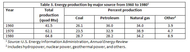
In its simplest form, a table is a group of rows and columns of data. At the top of each column is a column heading, which defines or identifies the contents of that column (and often it indicates the unit of measurement). On the left edge of the table are row headings, which define or identify the contents of that row. Things can get tricky when rows or columns must be grouped or subdivided. In such cases, you have to create row or column subheadings, as shown in Figure 5.
As you can see, the title and number for the table goes above the table. This is in contrast to other types of graphics where the title and number go below the graphic.
Guidelines for Using Tables
As with other types of graphics, you should refer to the table in the text just preceding the table. You should also explain the general significance of the data in the table; don’t expect readers to figure it out entirely for themselves.
Don’t overwhelm readers with monster 11-column, 30-row tables! Simplify the table data down to just that amount of data that illustrates your point—without of course distorting that data.
Don’t put the word or abbreviation for the unit of measurement in every cell of a column. For example, in a column of measurements all in millimeters, don’t put “mm” after every number. Put the abbreviation in parentheses in the column or row heading.
Right- or decimal-align numbers in the columns. If the 123 and 4 were in a column, the 4 would be right below the 3, not the 1.
Normally, words in columns are left-justified (although you will occasionally see columns of words all centered).
Column headings are centered over the columns of numerical data (forming a T-shape). When the table contains text rather than numbers, the column headings are left-aligned.
Just as you would cite and reference a paraphrase or a direct quote, so too must you cite and reference any tables that you use that were created by someone else or that were based on someone else’s data. Indicate the source of any graphic or data you have borrowed. Whenever you borrow a graphic or data from some other source, document that fact in the figure title using an in-text citation. You should also include the reference information in the reference list.
Charts and Graphs
Charts and graphs are just another way of presenting the same data presented in tables. At the same time, however, you get less detail or less precision in a chart or graph than you do in the table. Imagine the difference between a table of sales figures for a ten-year period and a line graph for that same data. You get a better sense of the overall trend in the graph but not the precise dollar amount. Other types of charts and graphs are horizontal bar charts, vertical bar charts, and pie charts.
Formatting Requirements
In bar charts and line graphs, don’t forget to indicate what the x and y axes represent. One axis might indicate millions of dollars; the other, five-year segments from 1960 to the present.
Bar charts, line graphs, and pie charts often use special colour, shading, or line style (solid or dashed). Be sure to indicate what these mean; translate them in a key (a legend) in some unused place in the chart or graph.
Include a title and numbered label for your charts and graphs. Include the title and label below the graphic, as shown in Figure 6 below.
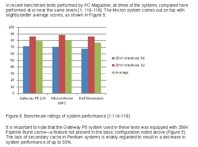
As you can see, there is text above and below the chart that calls attention to the graphic and briefly indicates its significance. To learn more about creating a chart in Microsoft Word, you can watch this video
Just as you would cite and reference a paraphrase or a direct quote, so too must you cite and reference any charts or graphs that you use that were created by someone else or that were based on someone else’s data. Indicate the source of any graphic or data you have borrowed. Whenever you borrow a graphic or data from some other source, document that fact in the figure title using an in-text citation. You should also include the reference information in the reference list.
Sample Text Integrated with Graphics
Let’s take a look at some samples. The first example below is a pie chart created with information the writer obtained from an interview. Notice that the writer provides a name for the visual, includes introductory sentences to provide context for the graphic, lists source information at the bottom of the chart, and finally, includes some closing remarks to tie it all together.
Not all gardeners will experience success with growing vegetables in Central Oregon, and the town of Sisters is especially challenging because of the varied temperatures all year long and the chance of frost or even freezing temperatures during any month of the year. Central Oregon and Sisters resident, Jane Doe, had the greatest success with the following vegetables in the year 2015 as noted in the pie chart below.
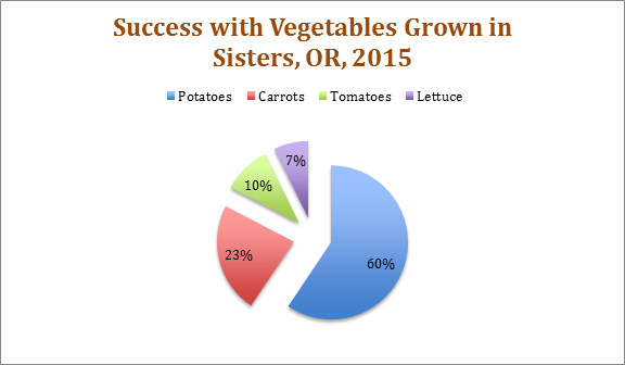
Source: Interview with Master Gardener, Jane Doe, 2 May 2016.
It is important to note that depending on the hardiness zone of the city, some vegetables may do better than others. Doe also commented that she protected her tomatoes either inside a greenhouse or under a hoop house.
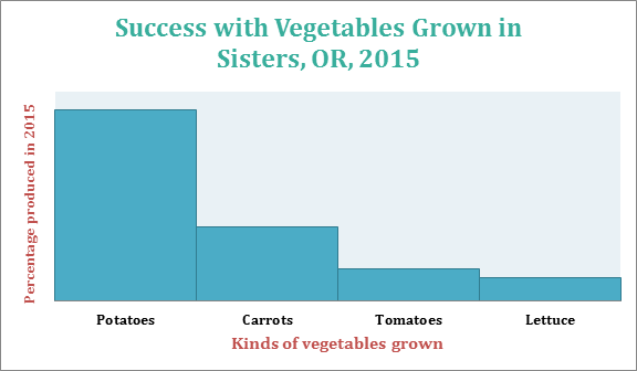
Below you will find another visual of the same information from the pie chart. It is provided to give you another way of visualizing the same information.
Finally, here is a simple table conveying information about plant hardiness zones for growers in Central Oregon. Notice again that the table isn’t simply inserted and left on its own for readers to interpret; the writer introduces the table with prefatory remarks and also provides follow-up commentary after the table.
The U.S. Department of Agriculture publishes a Plant Hardiness Zone Map which growers and gardeners use to help determine which plants, including vegetables and trees, will be most successful at a particular location. The table below shows the hardiness zone for four cities in Central Oregon and includes the annual minimum winter temperature—important information to keep in mind when determining not only which vegetables to plant but how long the growing season may be.
| Central Oregon City | Hardiness Zone | Winter Temperature Range |
|---|---|---|
| Sisters | 6a | -10 to -5 (Fahrenheit) |
| Bend | 6b | -5 to 0 (Fahrenheit) |
| Redmond | 6b | -5 to 0 (Fahrenheit) |
| Tumalo | 6b | -5 to 0 (Fahrenheit) |
Table 3: Hardiness Zones in Central Oregon. Source information: “United States Department of Agriculture.” USDA Plant Hardiness Zone Map. 2012. Web. 05 May 2016.
Before purchasing any plants or vegetables for your own garden, make sure you look at the hardiness number on the label to be sure that item will grow successfully in your climate zone.
Adapted from two chapters: 1) “Tables, Charts, Graphs” in the Online Technical Writing Textbook by D. McMurray and is used under a CC-BY 4.0 International license and 2) 8.4 Samples by Allison Gross, Annemarie Hamlim,Billy Merck, Chris Rubio, Jodi Naas, Megan Savage, and Michele DeSilva is licensed under a Creative Commons Attribution-NonCommercial-ShareAlike 4.0 International Liceense, except where otherwise noted.
Guidelines for Graphics
Keep the following in mind as you consider possible visual enhancements to technical writing:
- Use graphics to supplement or clarify information provided within the body of a text.
- Make sure your graphics are appropriate to your audience, subject matter, and purpose.
- Discuss graphics in nearby text preceding the graphic. Don’t just insert a graphic in your report unexplained. Orient readers to the graphic; explain its basic meaning, easily done in introductory and follow-up sentences before and after your graphic.
- Intersperse graphics and text on the same page. Don’t put graphics on pages by themselves; ideally, no visual should take up more than one-third of any page in your report.
- Use figure numbers and titles for graphics. Additionally, include identifying detail within the graphics such as illustration labels, axis labels, keys, and so on.
- Make sure graphics fit within normal margins. Leave at least one blank line above and below graphics.
- Place graphics as near to the point in the text where they are relevant as is reasonable. However, if a graphic does not fit properly on one page, indicate that it appears on the next page and put it at the top of the next, continuing with regular text on the preceding page. Don’t leave half a page blank just to keep a graphic near the text it is associated with.
- Cite all images that you create from any source material. You should do this in your introductory sentences before the visual as well as include a citation, if relevant, at the bottom of the visual. See samples above.
- Cite any images you use created by another writer which you include in your report. While it is perfectly legal to borrow graphics—to trace, photocopy, scan, or extract subsets of data from them, you are obligated to accurately cite your sources for graphics just as you are for the words you borrow.
Adapted from 8.5 Guidelines for Graphics: A Final Review by Allison Gross, Annemarie Hamlin, Billy Merck, Chris Rubio, Jodi Naas, Megan Savage, and Michele DeSilva, which is licensed under a Creative Commons Attribution-NonCommercial-ShareAlike 4.0 International License, except where otherwise noted.