
Basic Design and Readability in Publications
The way a text looks matters to a reader, so it should matter to a writer. Letters, reports, and blogs are more than just words on a page or a screen. How ideas are arranged and delivered in physical form, whether electronically or on paper, can make reading seem intimidating, confusing, or downright unfriendly, even if the content itself is perfect. Your text is like a room for your ideas. Sometimes you want readers to get in and out quickly, but often, you want them to sit down and make themselves comfortable, to put their feet up and stay awhile. Whatever the case, you should be in control of the reader’s experience.
And most readers are a lot like TV viewers with remote controls. In a moment, their attention is diverted to another channel if something about your content puts them off. It’s important to garner their attention and hold it. Good content is a key part of this, of course, but the visual presentation of your content matters, too. Reading is a difficult, cognitively demanding task, so if your design helps make your readers’ journey through the text easier, you will hold their attention longer. Give readers reasons to linger, and they will.
Good document design is both science and art. The particular design of a document—what it contains, what color scheme it follows, what alignment strategy it reflects, and so on—is the result of a series of choices made by the designer. It takes a long time to master the finer points of design, and this chapter won’t turn you into a designer, but it will offer some simple ways of thinking to help you strategize about how to make your document intuitive and reader friendly—easy to scan, search, and read.
This is not a section on design per se; rather, it will familiarize you with a few basic truths and a way of thinking that all designers know well. Whether you’re typing up a memo on new safety policies at work, producing a newsletter for your community group, or putting together a booklet describing the new app you just finished and wish to market, you need to think about a few basic elements of document design.
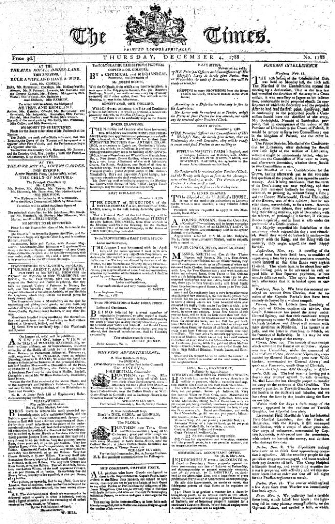
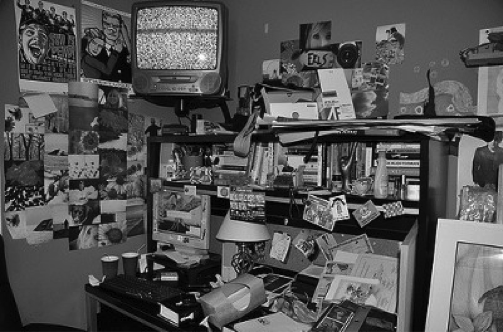
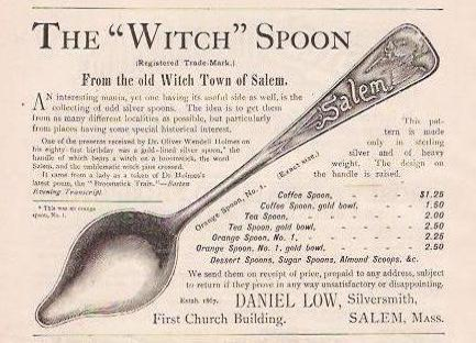
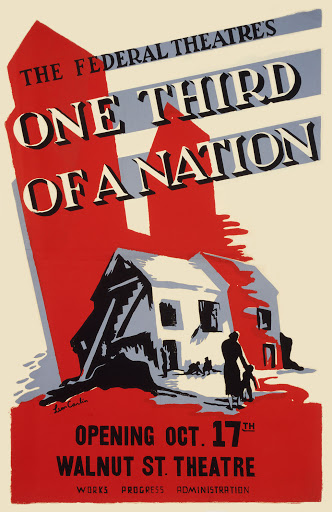
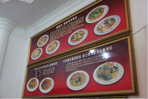
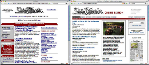
Spend a few seconds reviewing Figure 2; just looking at the front page is overwhelming. The design principles we are discussing are clearly missing from this image. While these design practices are broad, it’s worth mentioning that you already engage in some basic document design practices. For instance, when you format an academic essay, you center your title and regularly break to a new paragraph, which signals to the reader that it’s time for a breather, the content is shifting slightly, or you are moving on to a completely new topic. You illustrate blogs, Web pages, and PowerPoint slides with photos and graphics, animations, or videos. Even small elements of your writing help to guide readers: indentation, changes in type style (bold, italics, underline), or the punctuation at the end of a sentence.
Professional writers, especially those who work for well-funded web sites and mass-market print publications (like newspapers and magazines) are lucky enough to have the services of artists, graphic designers, skilled photographers, and layout experts. But most of us just want to have a cooler-looking blog, a more professional-looking report, or an eBay listing that doesn’t make buyers suspect our credibility.
This section briefly summarizes some fundamental concepts that you should consider as you revise and shape your text, whether it is in print or electronic form. Next, you will read and see examples of basic design principles that allow writers to combine graphic elements and text to convey a message to an audience.
Adapted from “Basic Design and Readability in Publications” by Allison Gross, Annemarie Hamlin, Billy Merck, Chris Rubio, Jodi Naas, Megan Savage, and Michele DeSilva is licensed under a Creative Commons Attribution-NonCommercial-ShareAlike 4.0 International License, except where otherwise noted.
Basic Principles of Readability
Make Your Publication More Inviting Using Basic Principles of Readability: CRAP
Despite the unfortunate acronym, CRAP is familiar to any graphic designer, and it should be familiar to writers as well. It originated with the influential designer and writer Robin Williams; she now regrets the acronym but not the ideas behind it.
I. C Is for Contrast: Use Difference to Draw Your Readers’ Eyes to and Through Your Text or Publication
You can see evidence of the most basic aspects of contrast in any Web page or magazine. The headline text is always different from the body text. It’s often bigger and bolder; it can also be in a different typeface. Headlines make it easy to skip from one story to the next and get a cursory understanding of the news; news writers make it easy for people to read only the headlines in a newspaper or Web site.
Applying strong contrasting elements to your text is important because the human eye is drawn to difference, not necessarily size. When everything looks the same, it’s difficult to focus on anything. When things are different, they are more noticeable.

When a document has few or no contrasting elements, nothing stands out. The document isn’t easy to scan, and it doesn’t invite the reader to jump in and read. It’s harder to parse, and therefore it’s difficult for readers to glean information from the text easily and quickly, if that is their aim.
Some documents, like business letters or academic papers, have fewer contrasting elements, but even line spacing and paragraph breaks help indicate where a related chunk of information begins and ends.
Contrast helps draw the reader’s eyes to certain elements in your text, and it also helps the reader follow the flow of the information and assess which items are most important and require immediate attention. Contrast creates readability, so you must pay attention to contrast in your documents. The following elements of a text can help you create a friendly, appealing sense of contrast:
Contrast Element 1: Size
Your eye moves toward things because they’re different, not because they’re large or small. Your eye is impressed by novelty more than sheer size or color or any other visual characteristic.
There are all sorts of scientific theories about why this is so, but in short, it’s not so much that making something bigger makes it more noticeable. A person’s height, for example, isn’t so noticeable until the principle of contrast comes into effect.
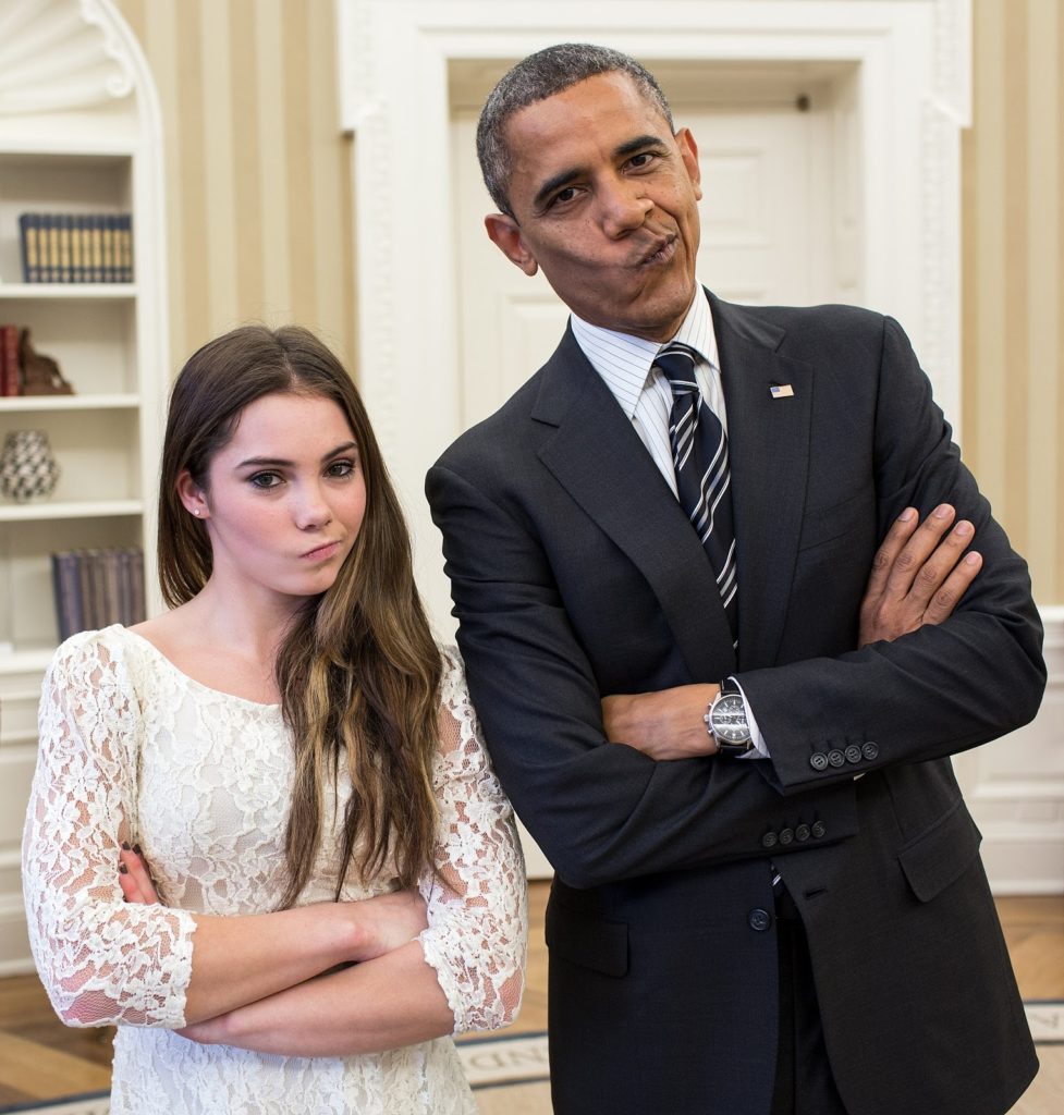
Both are fierce, but one is dramatically smaller. The contrast in size provides the visual drama, and pictures like these are favorite memes online.
There is such a thing as too much size contrast: think of those websites with huge type or an overly enthusiastic use of the CAPS LOCK key. Less is more, but some size contrast is essential to draw the reader’s eye.
Contrast II: Font/Size/Style/Weight
A typeface is a collection of fonts. The distinction between the terms typeface and font stretches back to the days of typesetting: hand-placing individual letters made of wood or metal, inking them, and rolling paper over them. In the digital age, most people use the words typeface and font interchangeably, though the distinction still matters to experts like designers and typographers.
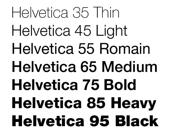
What’s important to most people is that we all have a huge variety of typefaces, or font families, to choose from: Times New Roman, Arial, Bookman, Georgia, and Garamond are familiar to many of us. It’s important to choose a font (a particular size, style, and weight within a typeface) that fits our purpose. Some, like script and handwriting typefaces, are too hard to read and so aren’t appropriate for body text, for example. Some typefaces work well as headlines: Franklin Gothic Condensed and Caslon are two typefaces often used for newspaper headlines. The “font” chosen (size, weight, style—italic, bold, etc.) will be the designer’s choice.
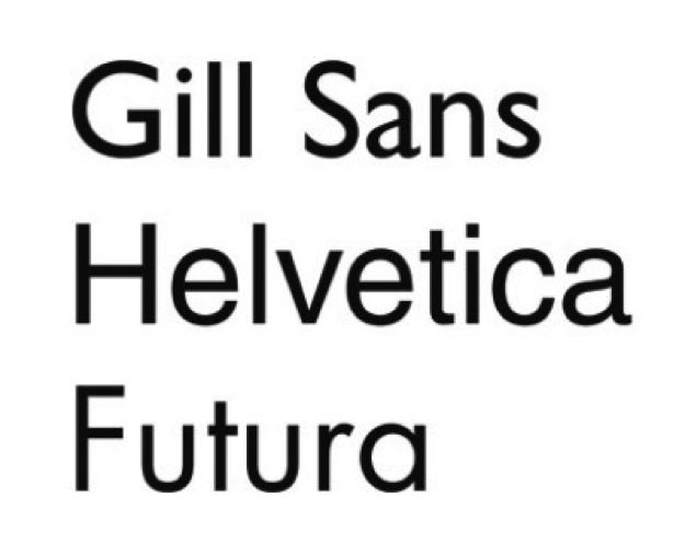
It’s also important to distinguish between serif and sans-serif fonts. Sans serif fonts, like Helvetica or Futura, are simple and smooth; the letters don’t display the “feet” and ornamentation (serifs) that serif fonts do. Sans serif fonts are often used for headlines, but serif fonts are more likely to be used for body text. Many typographers think serif fonts (also called Roman fonts) make large blocks of body text easier to read. Some of the preference is really just about tradition.

Contrast III: Direction (Vertical, Horizontal, Circular, etc.) or Position (Top, Bottom, Side)
Changing the direction or orientation of text, graphic elements like lines, banners, or screens (smaller transparent or opaque boxes, often in a color that contrasts with the background)
Contrast IV: Alignment (Center, Left, Right, Justified)
Most students are familiar with how to align type. MLA and APA style, for example, mandate left-aligned body text and a centered headline. MLA Works Cited pages call for a hanging indent of ½ inch. A change in alignment can create visual interest. For example, headlines are often centered to make them noticeable.
Images are often placed in a particular location on a page (or slide) to draw readers’ attention in one direction or another. Consistent alignment with slight variations to provide interest is particularly important in PowerPoint presentations. You will be flipping from one slide to another, and if the text blocks and headlines are not aligned identically, your text and headlines will appear to “jump around” the screen in a distracting way.

Contrast V: Graphic Elements Like Photos, Banners/Bands, Pull Quotes, or Logos
Remember, we’re trying to create contrast, or difference—breaking up huge blocks of text with a variety of graphic elements can really add visual appeal and interest. Just remember—as with the examples below, less is more. Think of all the publications and web sites you’ve seen whose designers thought it was awesome to make text bold AND underlined AND multicolored AND flashing. With a bright yellow background. And too many animated GIFs. It repels readers rather than attracting them. I know you know what I mean.
Contrast VI: Color (Background, Text, Graphic Elements, etc.)
Use color to make certain elements stand out. Create a sense of drama when you contrast one color with another. Make sure you don’t use too many colors and your color combinations are easy to read.
Contract VII: Use of Negative or “White” Space
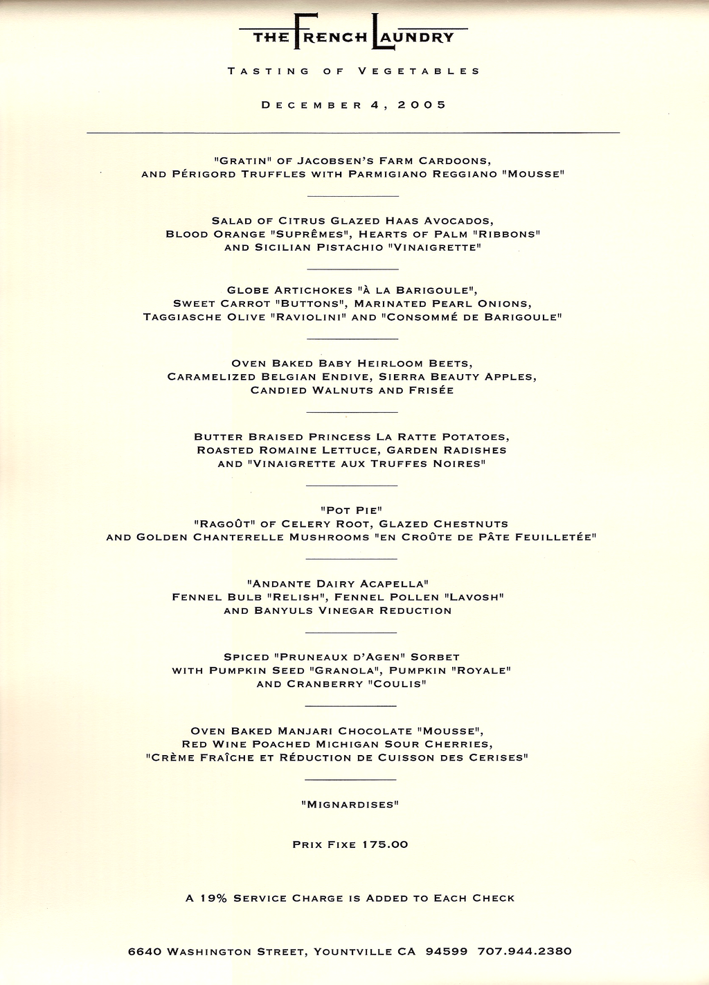
Sometimes, the best way to attract a reader’s attention to a contrast is to “go negative.” The absence of content provides air and space and draws the reader’s attention to the content itself. Negative space, or white space, is the space around text, images, and other elements in a document. It makes documents of all kinds (digital and print) more readable, more restful-looking, more inviting to the reader, simpler, and more elegant. It is associated with that “high-end” restaurant or salon menu look.
Adapted from Technical Writing 11.4 Concept 3: “Make Your Publication More Inviting Using Basic Principles of Readability: CRAP” Allison Gross, Annemarie Hamlin, Billy Merck, Chris Rubio, Jodi Naas, Megan Savage, and Michele DeSilva is licensed under a Creative Commons Attribution-NonCommercial-ShareAlike 4.0 International License, except where otherwise noted.
II. R Is for Repetition: Repeat Design Strategies Throughout Your Document to Provide a Sense of Connection
The basic rule of repetition means that in any text, visual or textual elements that have similar functions should be formatted similarly in order to create continuity and show close relationships between the elements.
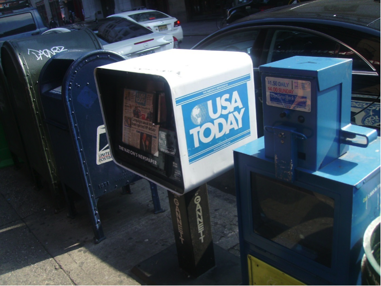
For example, newspapers have consistent ways of labeling different sections, like Sports, but there is also design consistency throughout the entire paper so you can tell that the section you just picked up belongs to a particular newspaper. USA Today in particular is notorious for its consistent repeated color coding and design.
On a smaller scale, in a resume, most applicants use bullet-pointed sections to list their job duties. “Repetition” in this context means that all these bullet points should be formatted identically: the same font, size, line spacing, and indentation. Each group of bullet-pointed items should be the same distance from the text above and below. The bullet points themselves should be exactly the same shape and size. These guidelines are a lot keep track of, but they are all important to your reader and the success of the document!
Repetition also applies to styles like MLA or APA. All titles are centered. All page numbers are in the upper right-hand corner, after your last name and a single blank character space. The same typeface is used throughout the paper. All paragraphs have exactly one empty line space between them. And so on.
Repetition means that every line classified as a “headline” should look like a headline, and headlines formatted to look alike can be identified as headlines with a similar function in the text. The same principle applies to body text. Fonts should not change without a reason. Lines, logos, and other graphic/visual elements should be formatted consistently. This repetition provides a sense of order and continuity that makes your document more readable and professional looking.
Since managing the formatting of multiple elements by hand can be difficult, many software programs provide templates—ready-made layouts into which you can plug your text and photos and thereby produce a variety of documents with a consistent look and feel. Microsoft Word, for example, also allows you to set Styles that will keep formatting choices like size, font, and style (bold, italic, etc.) the same for blocks of text with the same functions (body text, headlines, bullet points, subheadings).
Templates for newsletters, resumes, and PowerPoint presentations ensure that basic design elements like font size/style, color, image size and alignment are consistent from page to page. Templates provide a quick, easy way to solve repetition issues. Look at the difference repetition makes in even the most basic of resumes, for example. Contrast the two below.
III. A Is for Alignment: There Should Be a Clear, Deliberate Arrangement of Items on a Page
Alignment can refer to text, as in the left-aligned body text required in MLA style. But in document design, it means much more; it refers to how the entire document is arranged. Most designers align all their content to some sort of a grid or pattern, creating a distinct, intentional arrangement of items on a page or screen. They use plenty of white space to cushion the items, which makes higher-contrast items “pop.”
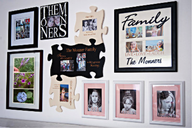
Imagine you’re hanging 20 pictures on a wall. You probably should not just throw them up there randomly. You might measure and equalize distances between items, put unusual items in certain places (like in the center), or put similarly shaped or sized items together. This will provide a sense of order to your arrangement of the items.
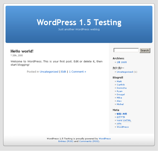
Software packages often allow you to draw lines or use an existing invisible grid to which you can “snap” items like images, blocks of text, or graphics. Templates do the hard work of arranging items on a page (or screen) for you. That’s why so many people use tools like WordPress, Illustrator, Publisher, Word, and PowerPoint—they allow you to arrange items easily, without the hard work of lining everything up by hand.
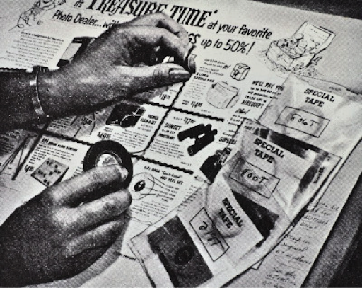
Newspaper and magazine layout artists once used various kinds of tape, contact cement (rubber cement), or wax adhesives to stick cut-out headlines, text blocks, photos, and ads to a page, just to produce a daily or weekly newspaper. To line up text and image blocks, they used wooden or metal rulers, graph paper, and T-squares. It was slow, tedious work. And rubber cement smells. The digital publishing revolution did away with all that. Most people who’ve spent half the night squinting over a yearbook layout that just won’t line up are glad about the changes.
Still, alignment problems have not all been solved in the digital era. See for yourself some of the results of less deliberate alignment vs. controlled, arranged items on a screen.
Learning how to arrange text and images artfully on a page takes tons of time, not to mention a whole email inbox full of user feedback, collaboration, thought, and hard work. This chapter will only acquaint you with some of the most basic elements of design. Perhaps after reading this chapter, you’ll start seeing CRAP wherever you look.
IV. P IS FOR PROXIMITY: ITEMS THAT HAVE SIMILAR FUNCTIONS OR PURPOSES SHOULD BE GROUPED TOGETHER
Is this a rock formation or just a random collection of boulders?


product of modern England, it was constructed in the year 2000 to commemorate local stonemasons and
the long history of quarrying local hamstone. “Ham Hill Stone Circle” by Gaius Cornelius is licensed under CC BY-SA 3.0
The second photo depicts a deliberate grouping, though it probably wasn’t hard to figure that out. When we work with pictures and blocks of text and not stones, think of this: when design or text elements are placed next to each other in certain ways, readers or viewers can see that they are meant to be considered together and have some sort of relationship. For example, photos and figures have captions that explain their contents. Nearby images often illustrate the content found in body text. Headlines are placed above body text whose content and focus they describe in briefer form.
Proximity can be especially critical in booklets, newsletters, and brochures, in which certain pages or panels might be grouped together under a subheading. Individual pages can be designed to reflect a larger relationship with the overall theme or subject matter. For example, the themes provided by blogging platforms like WordPress take care of this for you—every page will have a recognizable layout and though individual pages might be slightly different, they’ll be recognizably related to the blog’s main page. Web sites work the same way, as do book chapters.
The principle of proximity even affects white space: equal amounts of white space and equal line spacing indicate that items are related or should be considered as parts of a whole. If headlines, captions, or body text blocks aren’t close enough to the image or text to which they are related, the reader could be confused about what is—and is not—related.

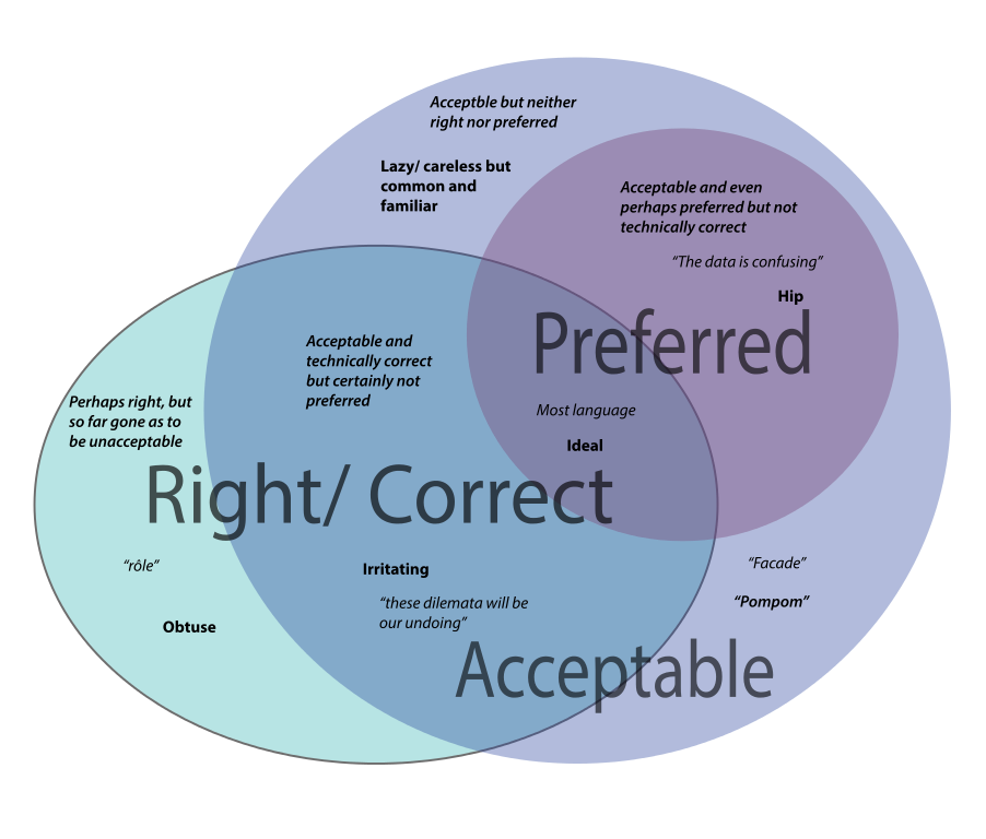
The Venn diagram above is very confusing. Why are there different font weights, sizes, and quotation marks setting off the words? Note that entries for the “Acceptable” lavender category are in both the top left and bottom right of the circle. Their relatively distant position (proximity) makes the relationship of these terms unclear. There are no headlines or labels here to help us understand, and the design strategy isn’t doing readers any favors.
Planning and adjusting how items are grouped on a page helps you design your text, graphics, and images so that readers can see what’s related, what goes together, what’s different, and what is similar. Relationships between items will be clear.
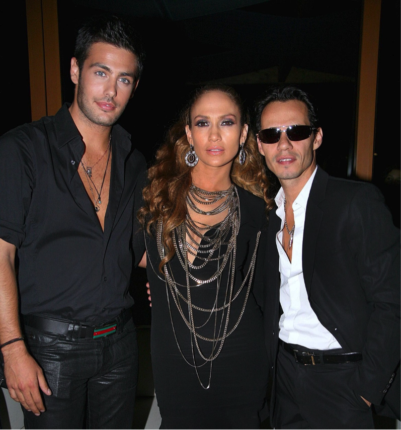
It’s clear which two are the couple in the illustration above. Same with headlines and body text, groups of bullet points, images and captions, and a whole lot more. What is close together will be seen to have a relationship. Moving items further away decreases the strength of that relationship in the minds of your readers.
Adapted from Technical Writing 11.4 “Make Your Publication More Inviting Using Basic Principles of Readability: CRAP” by Allison Gross, Annemarie Hamlin, Billy Merck, Jodi Naas, Megan Savage, and Michele DeSilva is licensed under a Creative Commons Attribution-NonCommercial-ShareAlike 4.0 International License, except where otherwise noted.